Context
Skyway is a SAAS application which sits between an organisation’s existing ticketing CRM and their website, expanding on functionality and reducing administrative effort of managing tickets, memberships, classes and other content.
As an events management platform, it consists of both a user-facing purchase path which can be branded and customised, as well as a business-facing CMS which box office and marketing staff use to manage and administer the site’s products and content.
As part of this project, my task was to completely refactor and redesign the interface of Skyway’s CMS.

Tasks
My role
While initial research and design explorations were carried out by myself and a colleague, I ended up taking on the majority of the later phases of the project by consolidating our early wireframes and iterating from there. This work took place over the course of three months.
My tasks
- Competitor research
- Analysing how the current CMS is used by staff and what issues they are facing
- Leading a positioning workshop with internal stakeholders with the goal of further defining Skyway’s baseline functionality
- Creating a design system which is flexible enough to allow for new functionality to be added continuously
- Setting up an efficient, well-documented design file which could be maintained and updated by the entire design team
- Prototyping interactions using Figma’s interactive components
Challenges
Designing an admin-friendly CMS to match a user-friendly purchase path
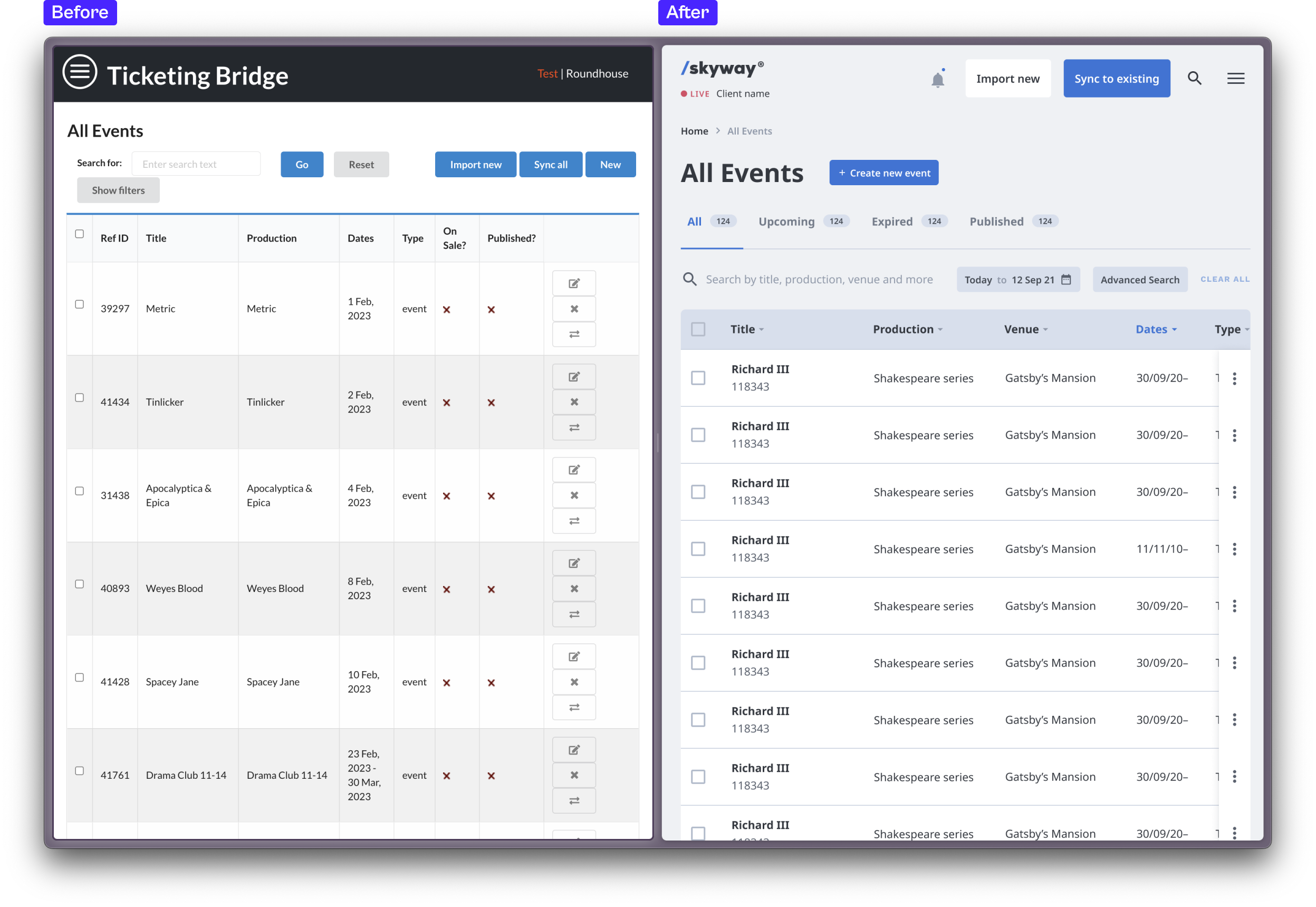
As the customer-facing part of the product, Skyway’s purchase path received the bulk of design improvements. The goal of this project was to match up end user and staff experience, making the CMS as painless and joyful to use as the purchase path.
Solution
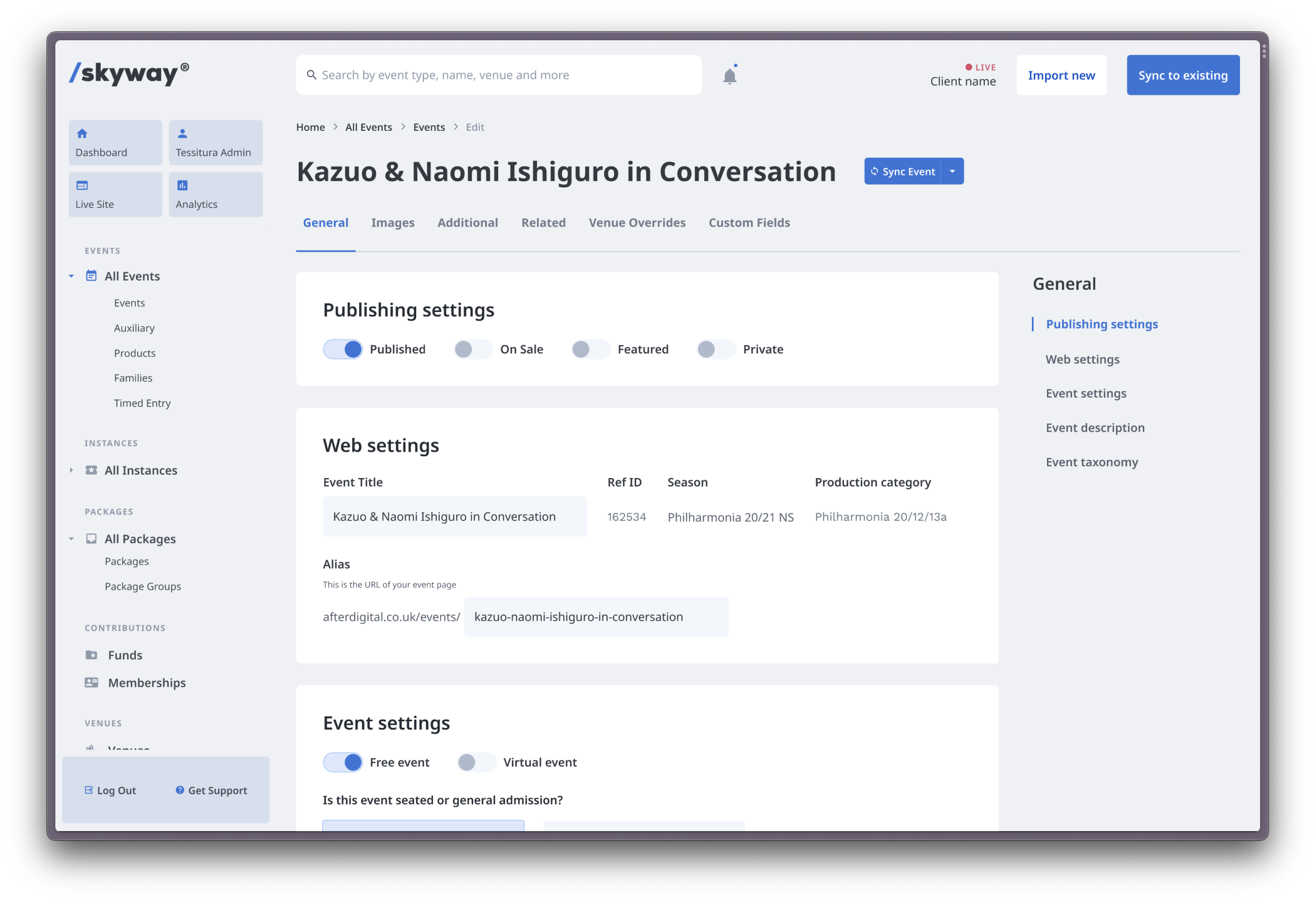
I revised typefaces, colour and iconography to create an interface that feels inviting and intuitive to use. Categorisation and naming of sections was completely refactored, and I included space for form field descriptions and helper text, with the aim of reducing the time needed to train staff to use the CMS.
A flexible design system that’s open to iteration and expansion
With flexibility being one of Skyway's main selling points, each client’s set up is tailored to their precise needs with the CMS required to encompass all of this. Furthermore, new functionality is constantly being added to Skyway and improvements are made, all of which need housing in the CMS.

Solution
To accommodate for this, I created a set of flexible card and table components, which are designed to be mixed and matched to build out each area of the CMS.
In one example, we added functionality for staff to be able to administer content hosted via a video streaming platform, which would allow organisations to expand their digital offering while still being able to administer all of their content from one location—the Skyway CMS.
My components held up neatly for this addition, with the minimal effort required to design out this area of the CMS.
Reflection
The new CMS design represents a marked step forward in Skyway’s progress as a standalone product. Built by a working agency this does not come without challenges. Time earmarked for the product often falls to the wayside if client work needs to be prioritised.
As such, we had only limited time to design the CMS, which meant we had to reduce the amount of user research we carried out initially, something we hope to expand on in the future as we receive client feedback.
The new CMS is currently being built by the development team.